VINEYARDS

DEL GREDAL


One more footprint in our enduring tradition of love and work with vineyards.

THE CHALLENGE

Del Gredal Vineyards needed to strengthen its brand image and position itself in a highly competitive market.

OUR SOLUTION

We studied its culture, products, market and potentialities, and that work served as the foundation for a new and complete brand identity.

Solución

Estudiamos su cultura, sus productos, su rubro y sus potencialidades, y en base a esto, construimos una nueva y completa identidad de marca.

Del Gredal Vineyards started out as what seemed the unattainable dream of a family: to produce quality wines in a place where no one had done it before. San Pedro Norte, in Northern Córdoba, is a special place, unique, with a terroir that can provide exquisite fruit. The Lozano family produces wines that are the perfect expression of the place. Having achieved a product that surpassed every expectation, their challenge and also ours was to show that value to the world.

BRANDING

We researched, thought of and defined a concept that could express the mystique of the area, defined by its particular weather and soil and also by its wonderful historical heritage.

From another land, another wine.

UNIQUE EXPERIENCES

Consumers won’t find anything like this in the market.

MYSTIQUE

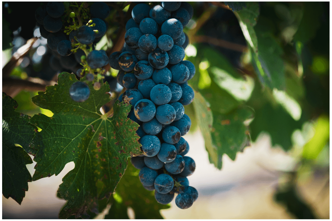
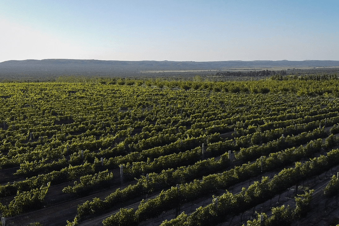
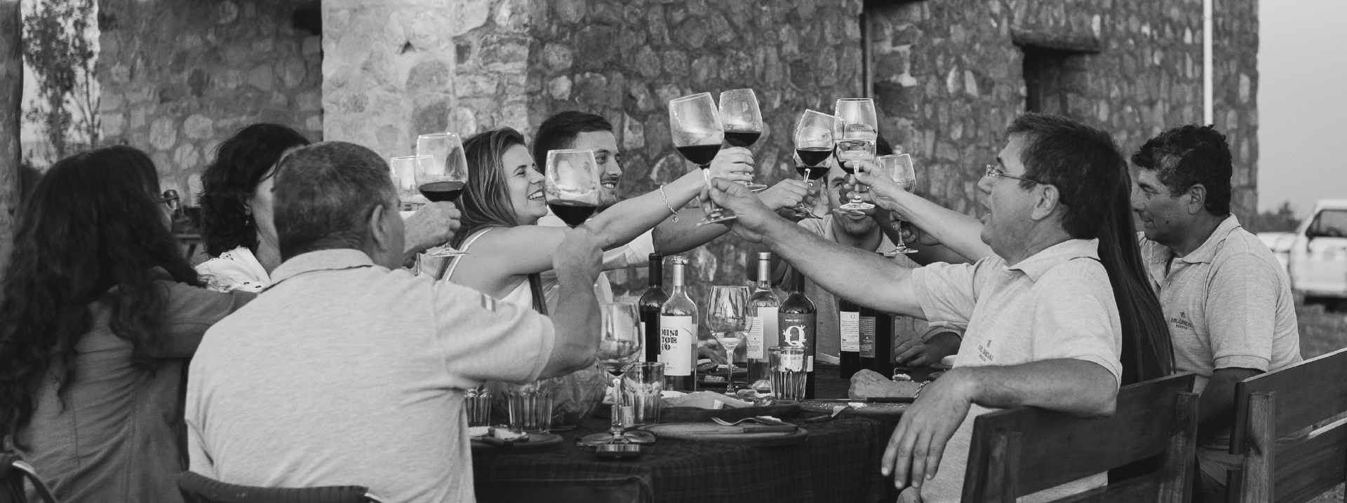
From a place pletoric with nature, unique and with a strong historical heritage.

RESPECT

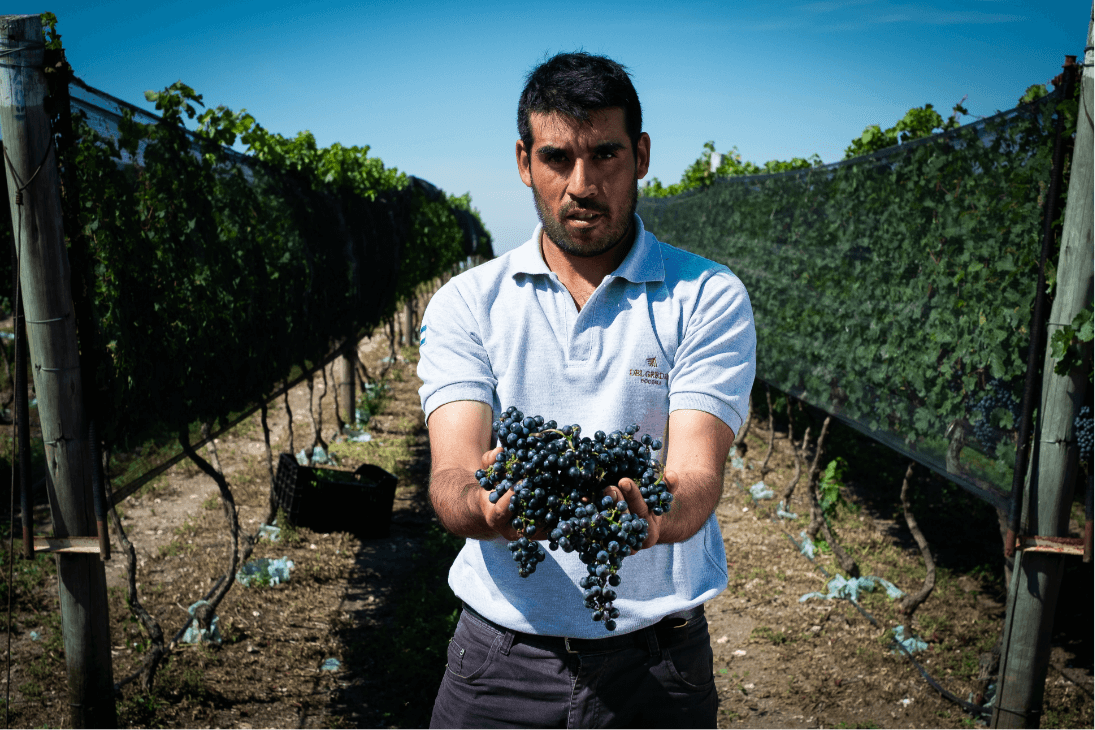
For the people, the place of origin and for our clients.

QUALITY

An essential requirement for all of our products.

AUTHENTICITY

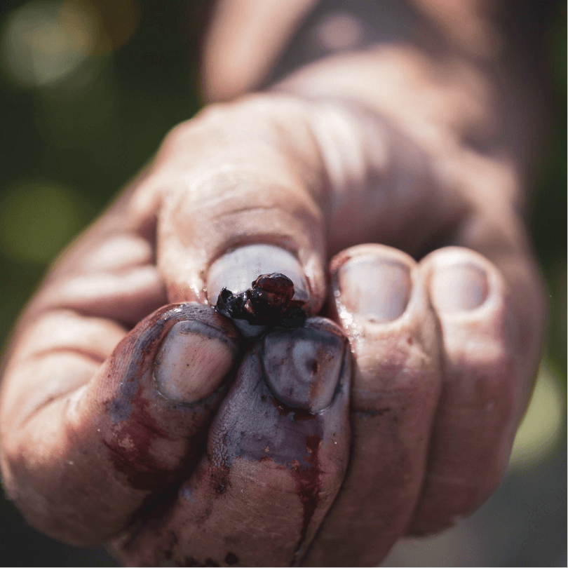
Ours is a product that represents the place that we chose, manufactured by local people and that intends to be a clear reflection of all that.

PERSONALITY

Sensible, warm, resolute, nature-loving, trustworthy, professional, inspiring, motivator, proud, moving, dreamer, cozy, mysterious, reserved, adventurous.

-->

CMYK: C:0% M:0% Y:0% K:100%

RGB: R:0 G:0 B:0

HTML: 000000

CMYK: C:0% M:0% Y:0% K:0%

RGB: R:255 G:255 B:255

HTML: FFFFFF

CMYK: C:54% M:0% Y:4% K:36%

RGB: R:74 G:163 B:156

HTML: 4AA39C

CMYK: C:0% M:61% Y:84% K:11%

RGB: R:226 G:86 B:36

HTML: E25624

WEB DEVELOPMENT

We developed a business-oriented website, cohesive with the brand’s concept and branding.

AUDIOVISUAL PRODUCTION AND ADVERTISING PHOTOGRAPHY

Being aware of the need for a powerful and moving spot that could be faithful to the brand, we produced the vineyard’s corporate spot: the brand’s presentation letter.

We shot when the harvest season was in full bloom, with the participation of locals. We embarked on a search for visuals that could reflect the poetic approach of the script. We composed an original soundtrack, since this place definitely has a sound of its own. A profound and subtle voice over narration rounded up the short film.

The film won a Copper award at the 14th Edition of the First Independent Advertising Festival (FEPI). This project also won a Elkon Silver award for corporate identity communication.